

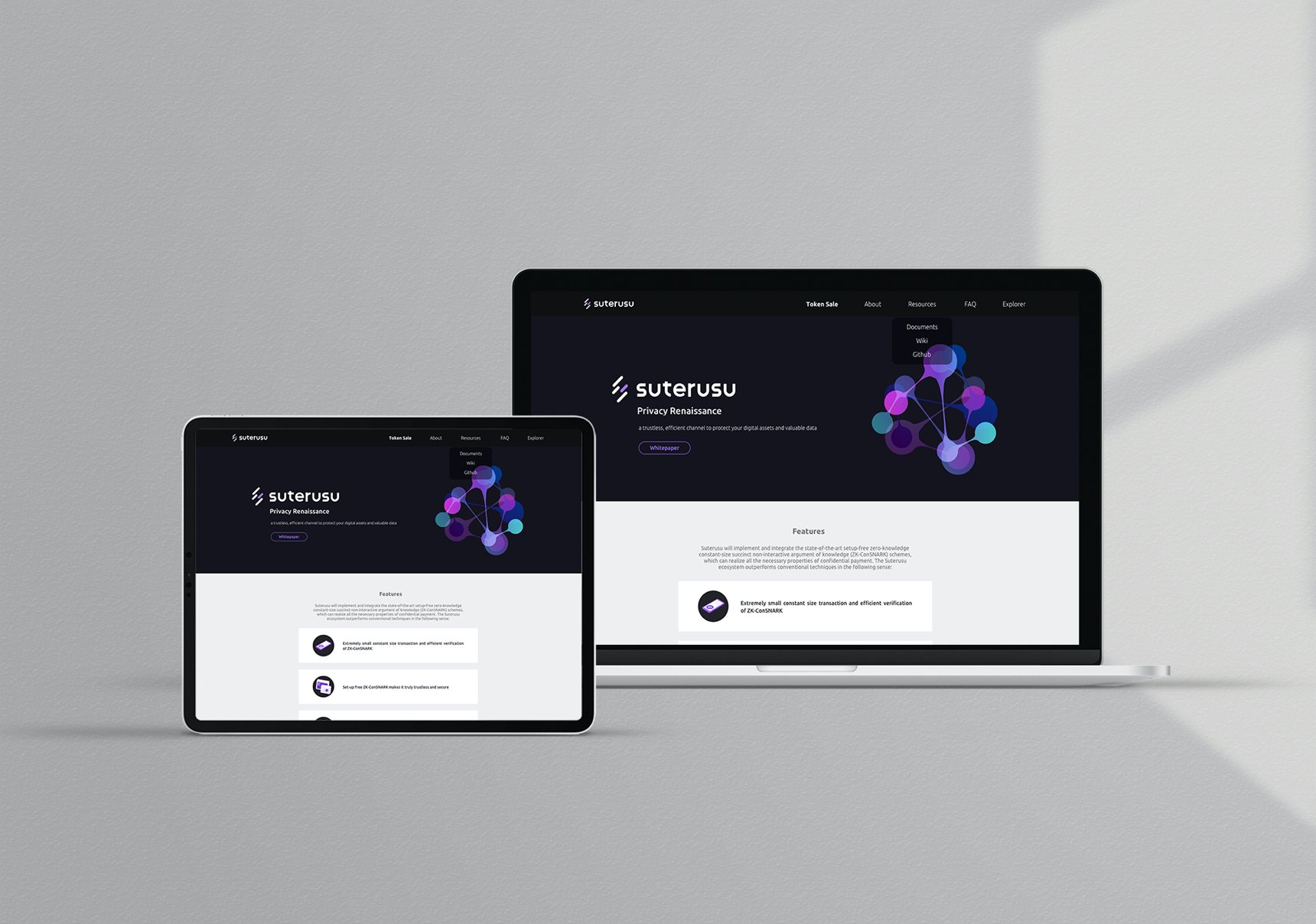
Suterusu is the pronunciation of stealth in Japanese (ステルス), which implies the idea of protective secret. The use of darker themed colors draws a connection to the idea of mystery and privacy, and the color of purple symbolize the wisdom and technology.
Suterusu is a private payment infrastructure for cryptocurrency, it provides an efficient channel to protect user’ digital assets and valuable data.

The sense of mystery and technology is expressed throughout the visual identity, from the consistent color palette to the use of dot and lines as geometric shapes in the visual language, the brand always shows that all things are connected in the crypto world.


CLIENT
SUTERUSU
COLLABORATED WITH
Guannan Cao
CATEGORY
BRAND IDENTITY
TOOLS USED
ADOBE PHOTOSHOP, ADOBE ILLUSTRATOR, SKETCH